YEAR:
2023
ROLE:
Lead Brand Designer
DELIVERABLES:
Photography Art Direction
CREDITS:
Character Illustration: Maryssa Pickett, Photography: Brittany Little
overview.
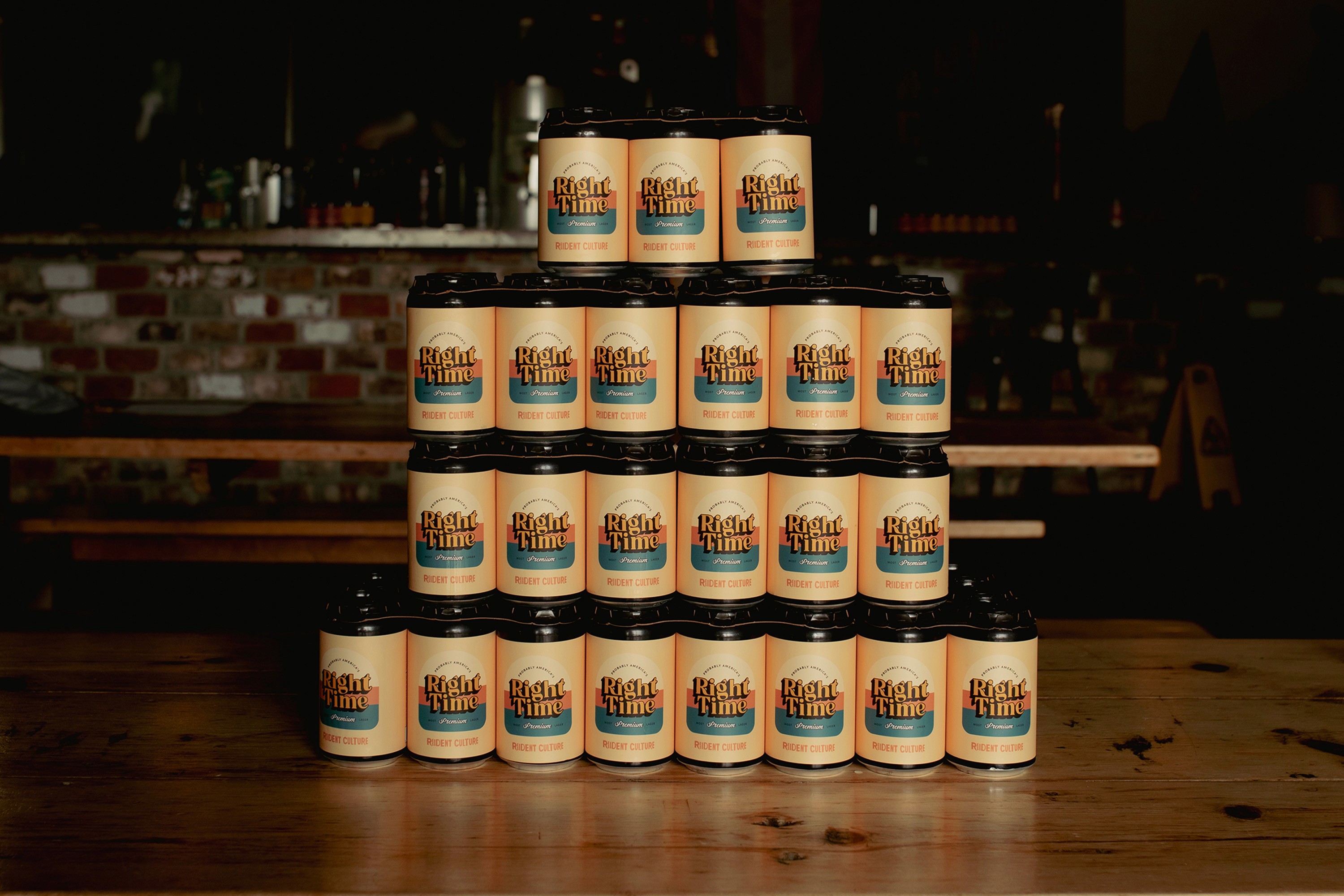
In a craft beer market heavily influenced by nostalgia, standing out means knowing which rules to bend and which to break. This brand and product identity design project came out of my in-house Graphic Design role at Resident Culture Brewing Company, where packaging was the product's first impression, built on a house style of grungy, recognizable illustration.
challenges.
Competitor research came first. The vintage-lager space was full of brands pulling from the same sepia-toned playbook, most locked into warm, muted palettes that blurred together on a shelf.
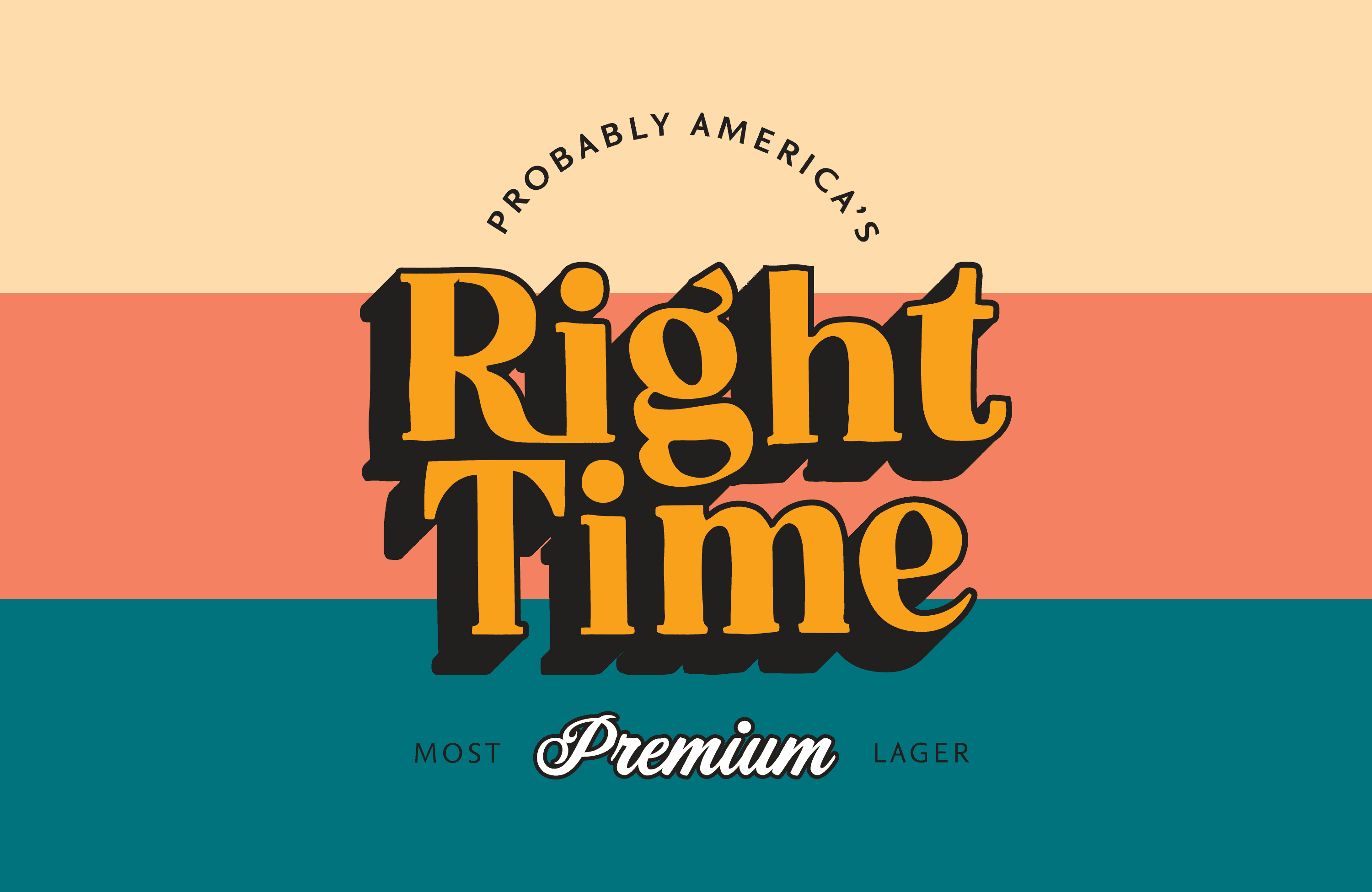
The solution was to sidestep that entirely in favor of black and gold as the base colors for the typography, flexible enough to hold its own across color schemes without needing to fight for attention. Accent colors came in as punctuation, with dark cyan and bright coral hues available to shift the mood without breaking the product line's visual system.

design choices.
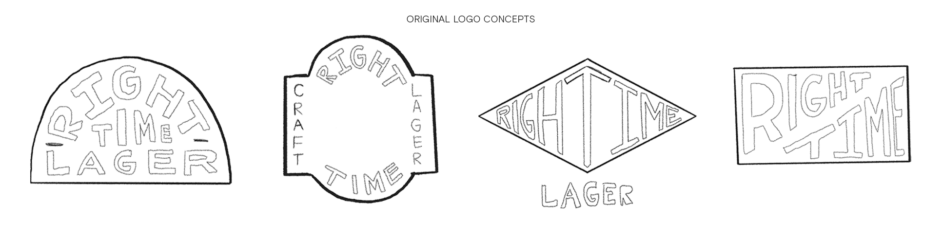
Early sketches explored traditional badge shapes: arched, diamond, rectangular. The vintage-lager market had already claimed most of them, and the more structured the shape, the more it blurred into the competition. The solution was to keep the badge logic without the badge rigidity, landing on a soft, outline-free lockup that read approachable rather than loud.
The character illustration, drawn by Maryssa Pickett, was an early contender for the logo itself. It had the right personality, but at label scale the detail wouldn't survive the print process. Pulling it out of the logo and into merchandise and secondary applications was the right call. It gave the illustration room to breathe and kept the logo clean enough to work anywhere.
results.
The final logo design held up as intended in the saturated market and performed well in small test groups aimed at our existing customer base, signaling that my design was successful and well received.
With such fun and intentional brand design, the merchandise brief for Right Time was simple: retro-leaning, actually useful, nothing that ends up in a drawer. Every item had to earn its place in someone's life, not just at the launch event.